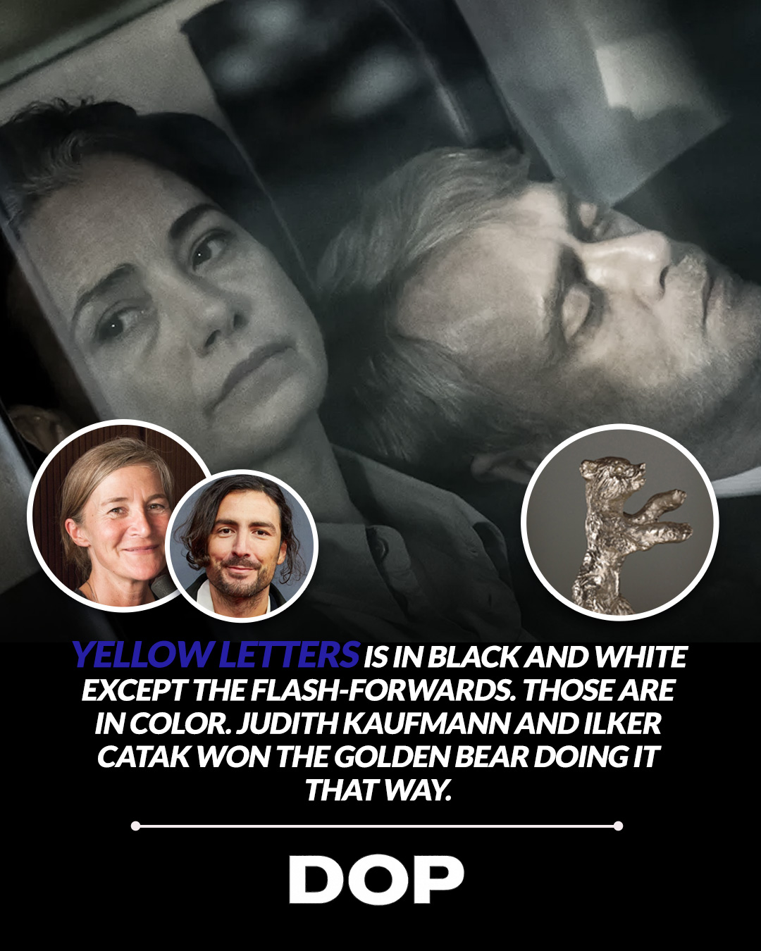
In the often-predictable lexicon of cinematic visual language, the transition from black and white to color typically heralds a moment of revelation, hope, or a return to a vibrant reality. Think Dorothy stepping into Oz, or the blossoming of a new perspective. Yet, with Ilker Çatak's Golden Bear-winning Yellow Letters, lensed with breathtaking precision by the masterful Judith Kaufmann, this established trope is not merely subverted; it's ingeniously inverted. The film, which clinched the top prize at the 76th Berlin International Film Festival, presents a powerful case study in how deliberate, unconventional aesthetic choices can profoundly deepen narrative impact, signaling not optimism but a chilling sense of dislocation and unraveling.
Kaufmann, a cinematographer whose discerning eye has previously graced films like the Oscar-nominated The Teachers' Lounge, once again demonstrates her profound ability to translate complex emotional landscapes into visual poetry. The foundational decision for Yellow Letters was audacious: the main narrative unfolds in monochrome, while the flash-forwards are rendered in full color. This wasn't a post-production flourish but a fundamental script-level directive, a testament to the collaborative vision between director and DP. It immediately sets an expectation, one that Kaufmann and Çatak gleefully dismantle, challenging our preconceived notions of how color and light function within storytelling.
The Unsettling Palette of Reality
The black and white photography of the primary timeline is not merely nostalgic or artistic; it serves as a stark, almost documentary-like anchor to the protagonist's present. It strips away the distractions of hue, forcing the audience to confront form, texture, and the raw emotional performances. One can imagine Kaufmann meticulously crafting this monochrome world, perhaps utilizing specific filters to control contrast and grain, or employing lenses known for their crispness and ability to render subtle tonal gradations. Was it a digital monochrome capture, maximizing dynamic range, or a more filmic emulation, embracing the inherent characteristics of older emulsions? Regardless, the aim was clarity in its bleakness, a visual representation of a life stripped bare.
"The character experiences loss and falls into this circle of misery and addiction, and we wanted to reflect that in the cinematography. The color is unnerving, not optimistic."
Then comes the color. And it is not the vibrant, life-affirming spectrum we anticipate. Instead, it's described as "disorienting," "unnerving." This suggests a carefully curated, perhaps desaturated or even slightly sickly palette for the flash-forwards. This isn't the lush, saturated world of a dream or a happy memory; it's the harsh, unfiltered light of a reality that has become fractured and painful. Kaufmann’s choices here are critical. Did she opt for a wider color gamut, pushing the boundaries of what modern digital cinema cameras can capture, only to then manipulate those colors into something unsettling? Or did she lean into existing light, allowing the natural, sometimes unflattering, hues of real-world environments to underscore the protagonist's spiraling descent?
Technical Mastery & Narrative Intent
Considering Kaufmann's previous work, particularly the claustrophobic and intensely naturalistic lighting of The Teachers' Lounge, her approach to Yellow Letters likely involved a deep understanding of how light shapes emotion. For the black and white sequences, she might have favored hard light for dramatic shadows, or soft, diffused light to create a sense of oppressive flatness. The choice of lenses would also be paramount – perhaps prime lenses for their sharpness and minimal distortion in the monochrome scenes, contrasting with a more versatile zoom or even vintage lenses in the color flash-forwards to introduce subtle aberrations or a dreamier, more distorted perspective, further enhancing the sense of dislocation.
The genius of Yellow Letters lies in its refusal to conform to visual clichés. By making the color sequences represent a state of "misery and addiction," Kaufmann and Çatak challenge the audience to re-evaluate their fundamental understanding of cinematic language. The technical mastery involved in executing such a precise and counter-intuitive visual strategy cannot be overstated. It requires not only a deep command of cameras, lenses, and lighting, but also an acute sensitivity to narrative and character. This is cinematography not as mere decoration, but as an integral, subversive force, driving home the film's thematic core with every frame.
In an era where visual spectacle often prioritizes grandeur, Yellow Letters reminds us of the profound power of intentionality. It's a masterclass in how a cinematographer, working in true synergy with a director, can manipulate our most ingrained visual associations to create a deeply resonant and profoundly unsettling experience. Judith Kaufmann's work on this film is a powerful argument for the artistic bravery and technical precision that continues to push the boundaries of visual storytelling, proving that sometimes, the most disorienting colors can speak the loudest truths.
This article contains affiliate links. We may earn a small commission at no extra cost to you. Learn more.