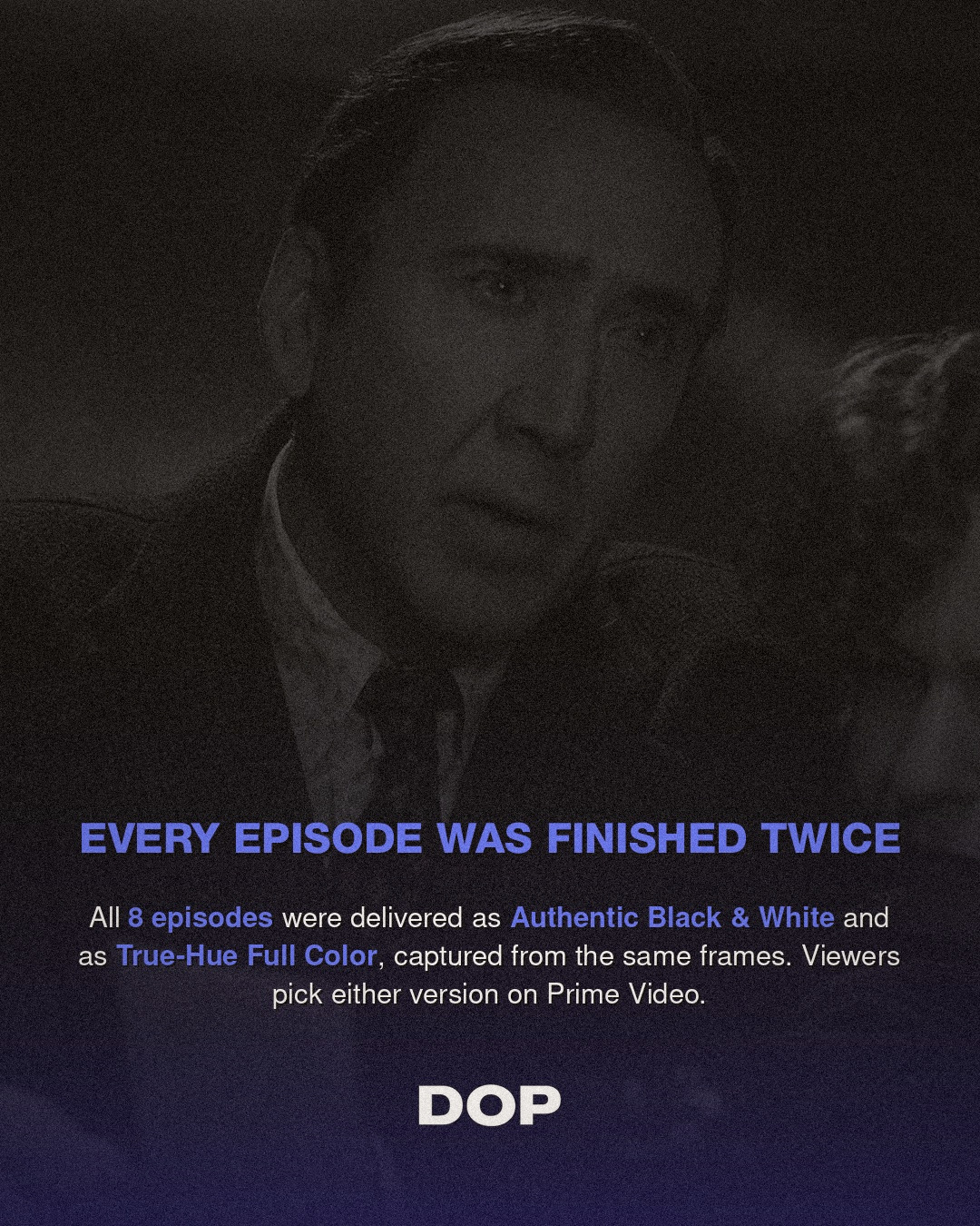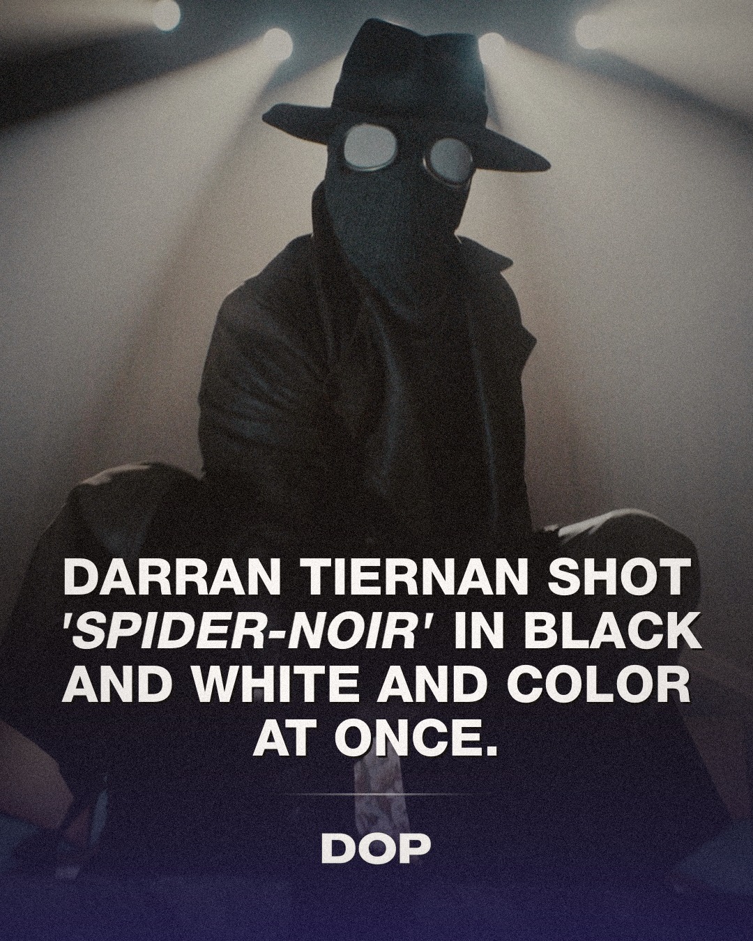
In an era often dominated by oversaturated palettes and digital uniformity, Prime Video's Spider-Noir emerged as a compelling anomaly, not merely for its narrative ambition but for its audacious visual strategy. The series presented audiences with an unprecedented choice: experience its eight episodes in either authentic black & white or a meticulously crafted 'True-Hue' full color. This wasn't merely a post-production filter; it was a testament to a deeply considered cinematographic approach, where two distinct visual realities were born from the same frames, offering a profound commentary on perception and storytelling.
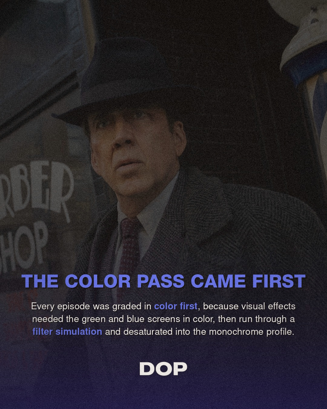
The logistical and artistic challenges inherent in such a dual-format production are staggering. Darran Tiernan, ISC, who shot the bulk of the season, alongside Peter Deming, ASC, who helmed episodes 5 and 6, navigated a tightrope walk between two distinct aesthetic demands. The revelation that the color grade was prioritized, primarily to accommodate the intricate visual effects work, which necessitated green and blue screens in their native hues, speaks volumes about the foresight required. This wasn't a retrofitting; it was an integrated strategy where the color version served as the foundation, allowing the black & white to be an intentional, artistic distillation rather than a mere desaturation.
The Art of Light: Shaping Shadows and Hues
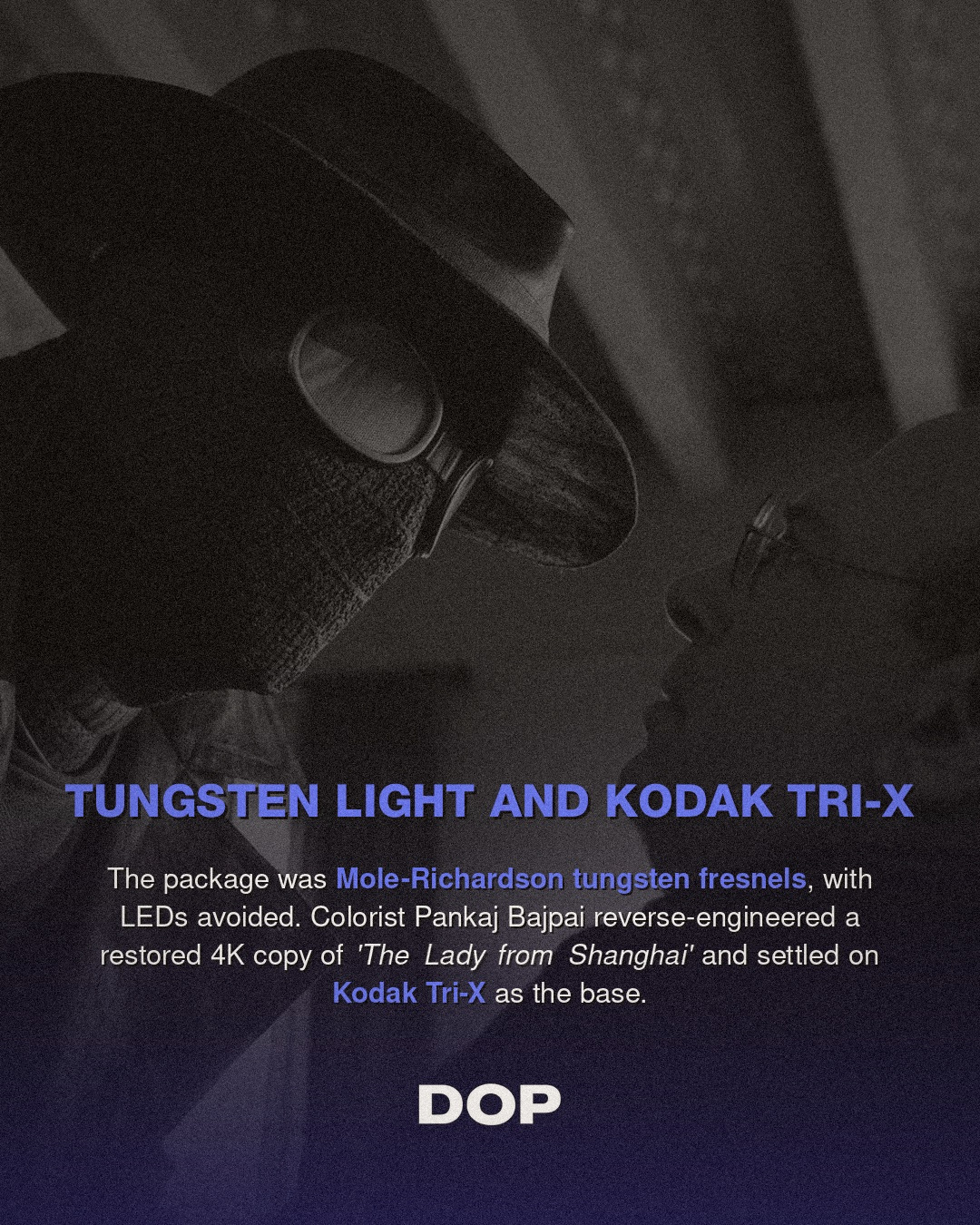
The choice of lighting tools speaks directly to the desired aesthetic. Deming's reliance on Mole-Richardson tungsten fresnels for his episodes is particularly insightful. Tungsten sources, known for their warm, continuous spectrum, lend themselves beautifully to both color fidelity and the creation of rich, dimensional shadows essential for noir. The hard, controllable beam of a fresnel allows for precise sculpting of light and shadow, defining characters and environments with stark contrasts that translate powerfully into monochrome. In the black & white version, the interplay of light and dark becomes the primary narrative device, demanding an intensity of contrast and texture that softer LED sources might struggle to achieve without significant manipulation.
Tiernan's and Deming's work demonstrates a profound understanding of how light functions as a narrative element. Every practical lamp, every carefully placed key and fill, had to serve a dual purpose: to render a believable, vibrant world in color, and to carve out a stark, evocative tableau in black & white. This often means lighting for separation and depth through contrast, rather than solely through color differentiation. The textural qualities of surfaces, the sheen of rain-slicked streets, the grit of urban decay, all had to register with equal impact across both formats, a testament to the DPs' mastery of their craft.
"To create two visually distinct versions from a single shoot isn't just a technical feat; it's a philosophical statement on how light, shadow, and color fundamentally alter our perception of a story."
The Monochrome Masterpiece: From Kodak Tri-X to Digital Noir
The heart of Spider-Noir's black & white aesthetic lies in its deliberate homage to classic film noir. Colorist Pankaj Bajpai's meticulous approach to reverse-engineering the look of Orson Welles' The Lady from Shanghai and settling on the iconic characteristics of Kodak Tri-X film stock is a critical detail. Tri-X is renowned for its fine grain, broad tonal range, and ability to render deep, velvety blacks and crisp whites, making it a favorite among still photographers and cinematographers seeking a timeless, gritty realism. This wasn't a casual emulation; it was a deep dive into the photographic history of noir, understanding the emulsion's response to light and shadow, its unique contrast curve, and how it renders textures.
Bajpai's process likely involved extensive LUT (Look Up Table) development and intricate secondary grading to ensure that the digital footage, regardless of its original color intent, carried the soul of Tri-X. This is where the true artistry of the colorist shines, translating the analog nuances of film stock into a digital pipeline while maintaining the integrity of the cinematographers' lighting choices. The result is a black & white image that feels authentic, not merely desaturated, but imbued with the spirit of classic cinema, resonating with a generation of viewers accustomed to digital perfection yet craving tactile authenticity.
A Dual-Format Future?
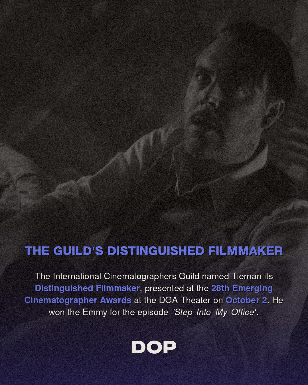
The success of Spider-Noir, underscored by Darran Tiernan's well-deserved 2026 Emmy win for Outstanding Cinematography For A Series, raises fascinating questions about the future of visual storytelling. Does this pioneering effort herald a new trend in dual-format releases, offering audiences a choice that deepens their engagement with the narrative? While logistically challenging and budget-intensive, the artistic dividends are undeniable. It forces cinematographers, directors, and colorists to think more deeply about the fundamental elements of visual language: how light sculpts form, how shadow evokes mood, and how color (or its absence) shapes emotional resonance.
For those of us passionate about the craft, Spider-Noir serves as a powerful reminder that technical innovation, when guided by a clear artistic vision, can push the boundaries of what's possible. It’s not just about advanced cameras or cutting-edge software; it’s about a profound understanding of light, composition, and the emotional impact of an image. Tiernan, Deming, and Bajpai have not only delivered a compelling series but have also provided a masterclass in how to honor the past while boldly stepping into the future of cinematography, proving that sometimes, the most profound visual experiences come from offering two paths to the same truth.