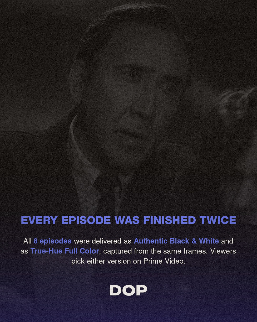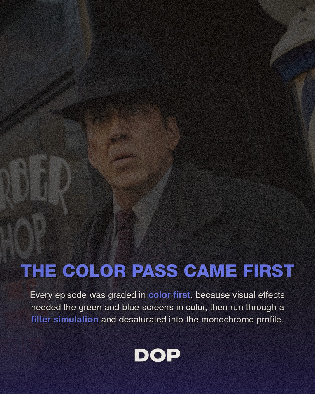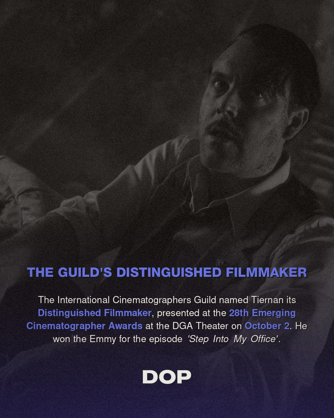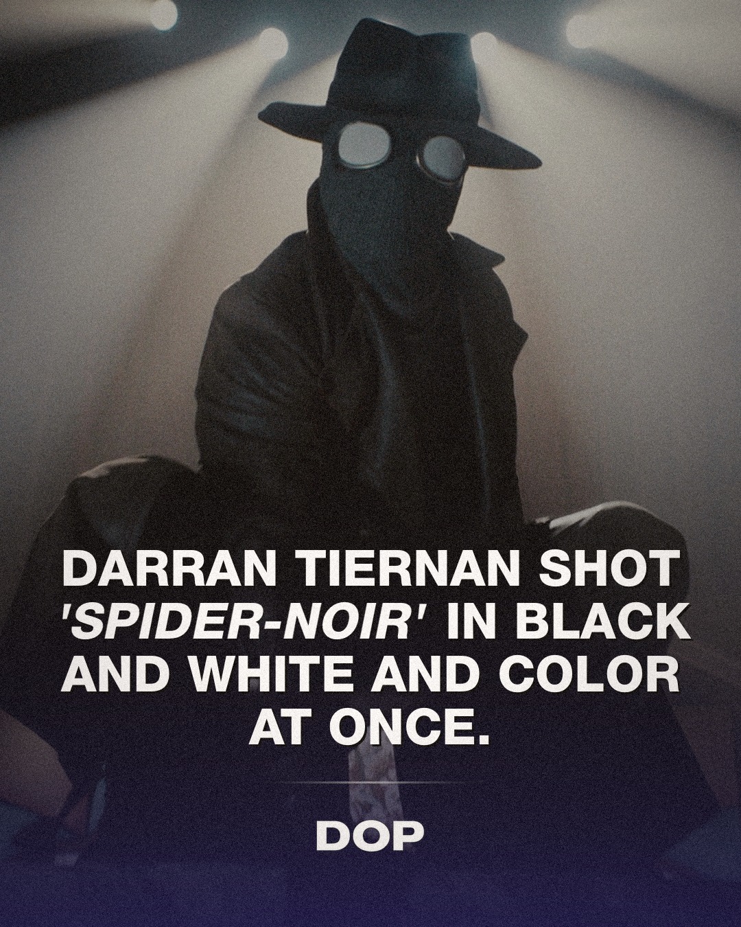
In an era often dominated by digital perfection and algorithmic color grading, the cinematography of Spider-Noir stands as a bold, almost defiant, artistic statement. At its heart lies the visionary work of Darran Tiernan, ISC, who, alongside Peter Deming, ASC, navigated the complex terrain of delivering a series simultaneously in two distinct visual languages: authentic black and white and true-hue full color. This wasn't merely a post-production trick; it was a foundational philosophy that informed every technical and artistic choice, culminating in Tiernan's well-deserved 2026 Emmy win for Outstanding Cinematography for 'Step Into My Office'.
Tiernan's approach to Spider-Noir was rooted in a deep reverence for classical cinema, yet executed with cutting-edge technology. The choice of the Sony Venice 2 at 8.6K was pivotal. This camera system, renowned for its full-frame sensor and exceptional dynamic range, provided the pristine, high-resolution canvas necessary to capture the intricate details that would serve both monochromatic and chromatic interpretations. Shooting at 8.6K wasn't just about future-proofing; it offered an unprecedented level of detail and flexibility in post, ensuring that neither the stark beauty of black and white nor the richness of full color felt compromised. The 1.85:1 aspect ratio, a classic cinematic choice, further anchored the series in a timeless aesthetic, lending itself well to both the gritty noir and the vibrant superhero genres.
The Lenses: Vintage Glass, Modern Vision
Perhaps the most evocative decision in Tiernan's arsenal was the deployment of rehoused Canon rangefinder primes from the 1950s. This choice was a masterstroke, imbuing the digital capture with an organic, period-appropriate character that modern, clinically sharp lenses often lack. These vintage optics, with their inherent imperfections, subtle flaring, gentle fall-off, and unique bokeh, added a layer of textural depth and emotional resonance. They softened the digital edge, providing a painterly quality that felt authentic to the noir genre while still holding up to the demands of an 8.6K sensor. This fusion of old and new speaks volumes about Tiernan's commitment to visual storytelling over mere technical prowess, proving that the soul of an image often lies in its imperfections.
"To achieve a truly authentic period look, you have to embrace the limitations and characteristics of the era's tools. Those Canon rangefinders weren't just lenses; they were time machines, injecting history directly into the sensor." - Darran Tiernan, ISC (paraphrased)
The decision to utilize these vintage lenses also played a crucial role in creating a cohesive visual language across both black and white and color versions. Their specific rendition of contrast and out-of-focus areas translated beautifully into monochrome, providing rich tonal gradations and separation. Simultaneously, their gentle color rendition and minimal chromatic aberration ensured that when the full-color version was rendered, it possessed a natural, unforced vibrancy, avoiding the harshness that can sometimes plague digitally shot images.
Lighting Philosophy: Tungsten's Timeless Glow
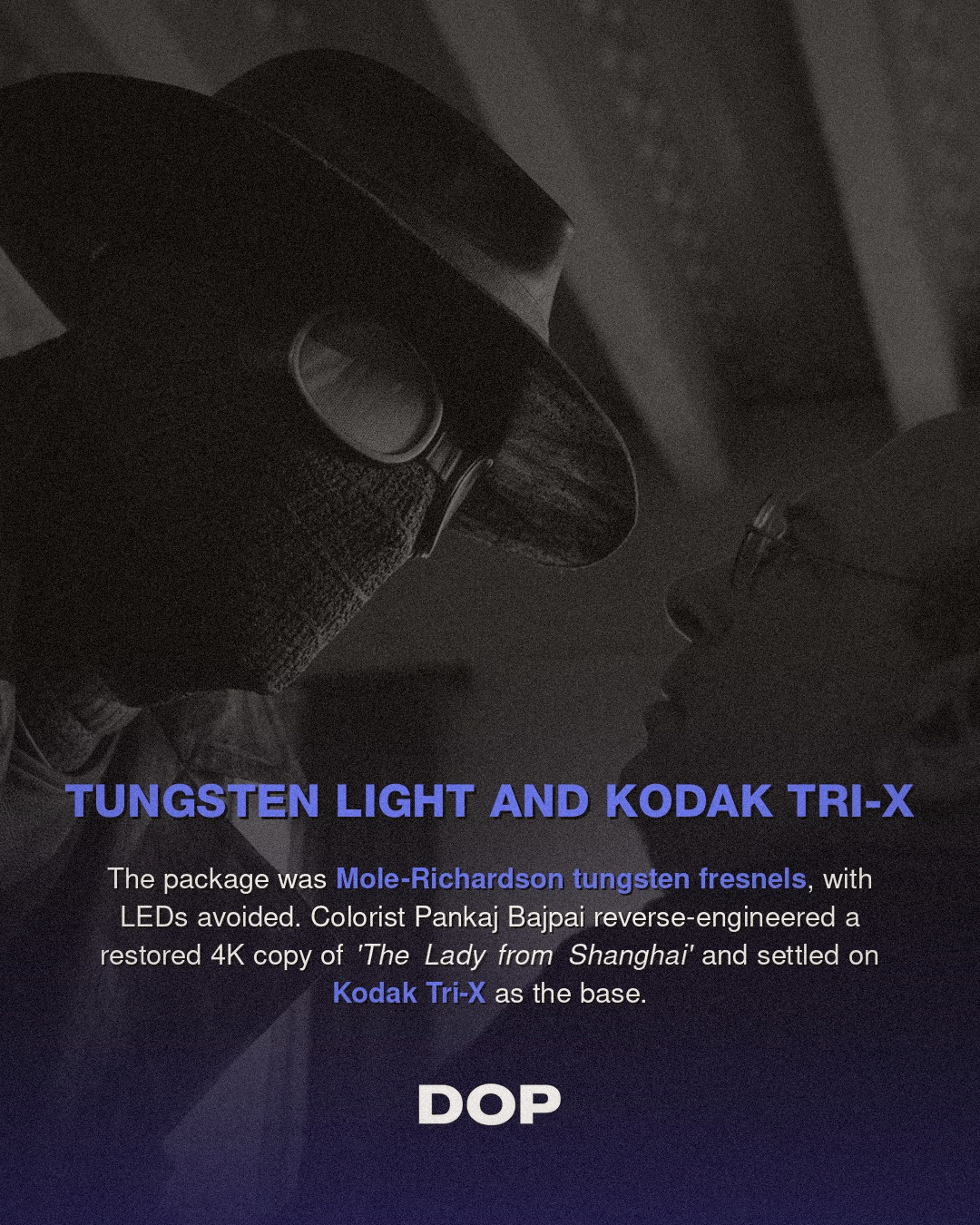
In a world increasingly lit by powerful, versatile LED fixtures, Tiernan’s commitment to Mole-Richardson tungsten fresnels for Spider-Noir was another deliberate and impactful choice. Tungsten lighting, with its warmer color temperature (around 3200K) and distinct spectral output, yields a unique quality of light that is inherently cinematic. It creates a beautiful, soft wrap and a pronounced fall-off that is ideal for sculpting faces and environments, particularly in the high-contrast world of film noir. The warmth of tungsten also translates into a rich, deep black-and-white image, offering nuanced grays and dense blacks, while in color, it provides a golden hour feel that can be either inviting or foreboding depending on its application.
Avoiding LEDs was a conscious decision to maintain the purity of the light source and prevent the subtle color shifts and digital feel that LED fixtures can sometimes impart, especially when aiming for a classic aesthetic. This dedication to practical, physically larger light sources allowed Tiernan to craft dramatic shadows and pools of light, building compositions that were as much about what was obscured as what was revealed. The interplay of hard and soft light, controlled through flags, cutters, and scrims, became a vital component of the narrative, emphasizing the psychological depth of the characters and the oppressive atmosphere of their world.
The Color Science: Reverse-Engineering a Classic
The final, crucial piece of this intricate puzzle was the color science, expertly handled by colorist Pankaj Bajpai. His task was monumental: to reverse-engineer the look of a restored 4K copy of Orson Welles' The Lady from Shanghai and land on the characteristic aesthetic of Kodak Tri-X film. This wasn't about emulation; it was about understanding the fundamental properties of a beloved black-and-white stock, its grain structure, its contrast curve, its spectral response, and translating that into a digital workflow.
Kodak Tri-X is famed for its rich blacks, crisp whites, and distinct mid-tone separation, giving it a timeless, documentary-like quality. Bajpai’s meticulous work ensured that the digital files, captured with the Venice 2's immense latitude, could be graded to truly embody this film stock's spirit. This bespoke color science not only informed the black-and-white version but also served as a critical foundation for the full-color rendition. By understanding how the Tri-X aesthetic was achieved, the team could then build a complementary color palette that felt organic and true to the noir sensibilities, ensuring that both versions of Spider-Noir felt like they were born from the same artistic vision, rather than being mere conversions.
Darran Tiernan's Emmy-winning work on Spider-Noir is more than just excellent cinematography; it's a masterclass in intentionality. Every choice, from the high-resolution sensor and vintage lenses to the tungsten lighting and bespoke color science, served a singular, ambitious vision. It stands as a powerful testament to how a deep understanding of cinematic history, combined with a willingness to push technological boundaries, can create something truly unique and deeply resonant. Tiernan has not only delivered a visually arresting series but has also set a new benchmark for creative flexibility and artistic integrity in modern filmmaking.
This article contains affiliate links. We may earn a small commission at no extra cost to you. Learn more.