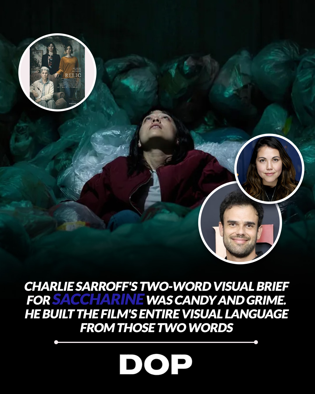
In an industry often seduced by the stark, the desaturated, and the overtly dark when depicting horror, the work of cinematographer Charlie Sarroff on Natalie Erika James's latest feature, Saccharine, offers a potent and thought-provoking counterpoint. Premiering in the Special section at Berlinale 2026, Sarroff's visual brief for the film was distilled into two deceptively simple words: 'candy and grime.' This isn't merely a stylistic choice; it's a profound philosophical underpinning that elevates the film's horror from jump scares to psychological lacerations, leveraging the power of contrast to unsettling effect.
Sarroff, an Australian cinematographer making his mark in Los Angeles, has articulated this 'candy and grime' approach as a deliberate subversion: "sweetness that conceals danger, gloss that harbours rot." This philosophy immediately brings to mind the unsettling domesticity and pastel-hued dread found in films like Relic (2020), James's critically acclaimed debut. While Relic masterfully explored the decay of the familiar, Saccharine, under Sarroff's lens, seems to weaponize the alluring, making the beautiful a Trojan horse for terror. This isn't about revealing the monster in the shadows, but rather exposing the monster that thrives in plain, vibrant sight.
The Psychology of Color and Contrast
The decision to embrace a 'candy-coloured palette' in a horror film is a bold one, flying in the face of conventional genre wisdom that often equates darkness with dread. Yet, it's precisely this subversion that makes Saccharine so compelling from a cinematographic perspective. By establishing a world of visual comfort and saccharine sweetness, Sarroff intentionally lulls the audience into a false sense of security. This visual ease becomes a prerequisite for the horror elements to land with maximum impact. When the 'grime' inevitably surfaces, it doesn't just shock; it violates the established visual contract, creating a deeper, more visceral sensation of unease.
"The candy comes first. The grime earns its place because of it."
This isn't merely about bright colors; it's about the meticulous control of color science and light. One can imagine Sarroff and his gaffing team meticulously crafting vibrant, yet often artificial, lighting schemes – perhaps employing a combination of high-output LEDs for their color fidelity and theatrical gels to achieve specific, hyper-real hues. The choice of lens would also be critical. To truly achieve that 'candy' aesthetic, one might speculate the use of lenses known for their clean, crisp rendition and minimal flaring, perhaps modern anamorphics for a touch of cinematic flair without compromising resolution, or even specific spherical primes with a slightly clinical, yet polished, feel. The goal wouldn't be to soften the image, but to make it almost too perfect, too inviting, thereby amplifying the eventual disruption.
Crafting the Visual Language of Discomfort
Sarroff's filmography, while perhaps less extensive than some veteran DPs, demonstrates a clear propensity for thoughtful visual storytelling. His approach to Saccharine suggests a deep understanding of how visual cues manipulate audience perception. Instead of relying on low-key lighting and desaturation to signal danger, he uses high-key, saturated imagery to create a disarming facade. This technique requires an almost surgical precision in color grading – ensuring that the 'candy' never veers into pure camp, but maintains a subtle undercurrent of artificiality that hints at the rot beneath.
Consider the technical implications: shooting on a camera system with excellent color rendition and dynamic range would be paramount. A modern digital cinema camera, perhaps an ARRI ALEXA or a Sony VENICE, would provide the latitude necessary to capture both the vibrant highs and the nuanced shadows that define Sarroff's 'candy and grime' dichotomy. The ability to push and pull color in post-production, maintaining fidelity while subtly shifting palettes, would be crucial to achieving the desired effect. The 'grime' wouldn't necessarily be a sudden desaturation, but perhaps a subtle shift in color temperature, a slight desaturation of specific hues, or the introduction of textural elements through astute production design that appear jarring against the otherwise pristine visual backdrop.
Ultimately, Charlie Sarroff's work on Saccharine is a masterclass in visual irony. By daring to make horror beautiful, he intensifies its impact. He reminds us that true terror often lurks not in the shadows, but in the glaring light, disguised by an irresistible, yet ultimately poisonous, sweetness. This is cinematography that doesn't just capture a story; it crafts an experience, manipulating our senses with the precision of a surgeon and the artistry of a painter. It’s a testament to the power of a well-defined visual brief and a DP's unwavering commitment to its execution, proving once again that the most innovative approaches often come from challenging established norms.
This article contains affiliate links. We may earn a small commission at no extra cost to you. Learn more.