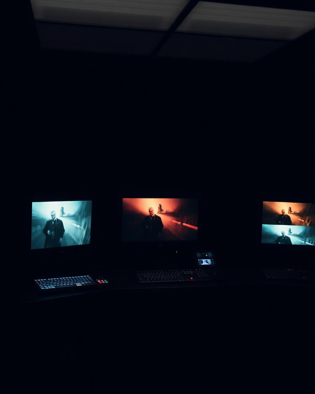
The most subtle cinematography is often the work that takes the most precise planning. Atlantics (2019), directed by Mati Diop with cinematography by Claire Mathon, is a film that changes color over the course of its runtime without the audience noticing the shift until the world has already transformed. This is not a technical effect. It is a narrative strategy executed with absolute discipline, and it has become one of the most discussed visual approaches in recent independent cinema.
The film's first act is warm. The light that surrounds the young workers on Dakar's beach has the golden quality of summer, of life, of presence. But as the film progresses—as the supernatural element enters the story, as the loss becomes apparent—the color temperature shifts progressively cooler. By the film's final sequences, the world is blue. But no single frame announces that change. The audience's eyes adapt along with the story. We do not realize that the world has gone cold until we are already inside it.
This required a level of planning that most director-DP collaborations never achieve. Mathon and Diop could not improvise this decision on set. They had to agree before production began exactly how many kelvin degrees the color temperature would shift per day of shooting, how gradually the move would be, and how the cool would be sustained without breaking the immersion of the narrative. Every light source across a multi-week shoot had to contribute to this invisible progression. The gaffer had to understand not just the requirements of each scene, but the cumulative effect of light choices across the entire film.
Mathon's approach treats color as something the audience experiences before they consciously register it. The human eye adapts to color temperature continuously—we do not notice when we move from incandescent light to daylight because our eyes adjust automatically. Mathon weaponized that perceptual mechanism. The cool does not arrive abruptly. It arrives so gradually that the viewer's eye accepts it as inevitable. By the time the world is visibly blue, it feels like it has always been blue. That is the opposite of a dramatic visual choice. It is an invisible one, working at the threshold of perception.
What makes Atlantics crucial for cinematographers is that it proves color can carry narrative function without announcing itself. Mathon did not use color grading to achieve this effect—though the DI would have been crucial to the final result. She built the color progression into every light choice on set. The cinematography did the work. The grading refined it. That discipline, that commitment to a visual strategy so subtle that it almost disappears, is the level of intention that separates cinematography from mere image capture.
The influence of Atlantics on the 2026 festival circuit is visible in films like Yellow Letters and Rose, both of which use color and color absence as temporal markers. But Atlantics remains the most sophisticated execution of that strategy, because Mathon and Diop understood something essential: the most powerful visual work is what the audience does not know they are seeing until it is too late to unsee it.
Atlantics went cold over the course of the film and nobody noticed until the world had already changed colour. Mathon planned that shift from the first week of shooting.
Gear Recommendations
- DaVinci Resolve Studio | Adorama – B&H Photo
- Tangent Element Panels | Adorama – B&H Photo
- Blackmagic Pocket Cinema Camera 6K Pro | Adorama – B&H Photo
- Cooke miniS4/i Prime Set | Adorama – B&H Photo
- SmallHD Ultra 7 Monitor | Adorama – B&H Photo
Note: Links above are affiliate links. Occupy Cinematography may earn a commission on qualifying purchases at no additional cost to you.