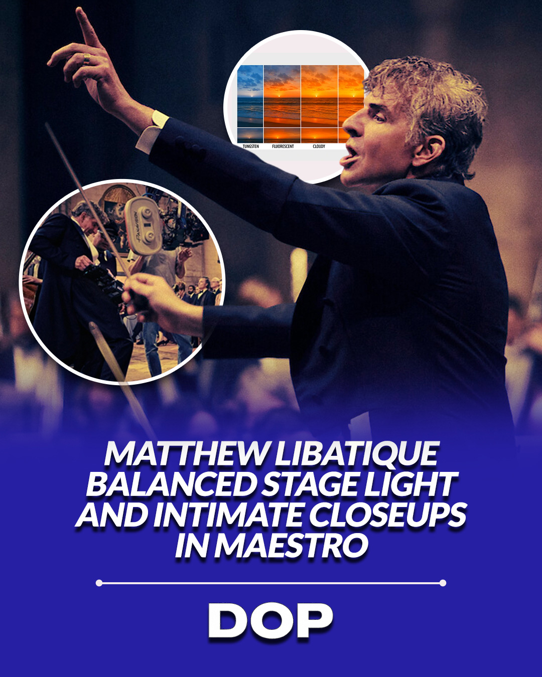
Bradley Cooper's Maestro is more than just a biopic; it's a profound cinematic exploration of Leonard Bernstein's complex life, brought to vivid, yet cohesive, visual life by cinematographer Matthew Libatique, ASC. Tasked with navigating an expansive narrative that spans decades, diverse locations, and radical shifts in visual style, from the grandeur of orchestral stages to the intimacy of cramped New York apartments, and the stark beauty of black-and-white to the vibrant hues of color, Libatique masterfully orchestrates a visual language that is both adaptable and distinctly unified. His work on Maestro stands as a testament to the power of thoughtful lighting and color design in cinematic storytelling.
One of the most striking aspects of Libatique's approach is his ability to articulate distinct visual worlds for different facets of Bernstein's life without sacrificing overall coherence. The concert scenes, for instance, are characterized by a dramatic, almost theatrical lighting scheme. Here, Libatique employs hard, top-down stage keys, often utilizing powerful HMI or tungsten sources positioned directly overhead, to sculpt the musicians and instruments with intense highlights and deep, velvety falloff. This technique not only emphasizes the scale and formality of the performances but also isolates Bernstein, drawing the audience's focus to his commanding presence on the podium. The contrast is often high, creating a chiaroscuro effect that mirrors the intensity and emotional weight of the music.
The Intimacy of Domesticity and the Art of Transition
In stark contrast, the domestic scenes, particularly those set within the confines of Bernstein's apartments, are imbued with a softer, more intimate glow. Libatique achieves this by moving away from hard, directional light, opting instead for larger, diffused sources that wrap around his subjects. Practical lamps, bounce light from ceilings, and carefully positioned softboxes create a lower-contrast, more naturalistic aesthetic. This softening of the light, combined with a subtle increase in ambient fill, cultivates a sense of warmth and vulnerability, allowing the audience to feel closer to the characters in their private moments. The genius lies in how Libatique maintains a consistent textural quality and skin tone rendition across these divergent lighting philosophies, ensuring that despite the shift in mood and intensity, the characters remain recognizable and emotionally resonant.
“For cinematographers, Maestro is a study in designing lighting and color strategies that let a biographical film jump around in time and space while still feeling like one continuous emotional line.”
The film's ambitious journey through time is further complicated by its audacious shifts between black-and-white and color. Libatique's handling of these transitions is nothing short of masterful. The black-and-white sequences, primarily depicting Bernstein's early career, are not merely desaturated; they are meticulously crafted to evoke the photographic sensibilities of mid-century still photography, particularly the works of masters like Richard Avedon or Robert Frank. He employs specific lighting ratios and filtration to enhance textures and create a rich tonal range, avoiding any sense of pastiche. This era often features slightly harder light and more pronounced shadows, lending a classic, timeless quality that grounds the audience in the historical context.
Technical Prowess and Emotional Continuity
As the narrative progresses and Bernstein's life unfolds, the film seamlessly transitions into color. This shift is executed with such grace that it never feels jarring. Libatique doesn't simply flip a switch; he carefully modulates the color palette, often starting with muted, desaturated tones that gradually blossom into richer, more vibrant hues as Bernstein's career and personal life reach their zenith. This gradual introduction of color mirrors the emotional arc of the story, allowing the audience to subconsciously experience the passage of time and the evolution of the characters' inner worlds.
While specific camera and lens choices for Maestro haven't been widely detailed, the visual evidence suggests a preference for lenses that offer a pleasing balance of sharpness and character, capable of rendering both the crisp detail of concert halls and the softer nuances of intimate scenes. Given Libatique's previous collaborations with Cooper and his known versatility, one might infer the use of high-resolution digital cinema cameras, likely ARRI or Sony, paired with vintage or purpose-designed glass to achieve that specific blend of modern fidelity and classic cinematic texture.
In Maestro, Matthew Libatique, ASC, doesn't just light scenes; he designs an entire visual ecosystem that breathes with the life of its subject. His ability to maintain a consistent emotional through-line across wildly disparate visual styles, from the theatricality of the stage to the quiet drama of domestic life, and from the evocative monochrome of the past to the vibrant color of the present, is a masterclass in cinematic continuity. For cinematographers and serious film enthusiasts, Maestro offers invaluable lessons in how strategic lighting, thoughtful color science, and meticulous visual design can elevate a biographical narrative into a truly symphonic experience.
This article contains affiliate links. We may earn a small commission at no extra cost to you. Learn more.