In the rarefied air of high-end cinematography, the distinction between color enhancement and color correction isn't just semantic; it's fundamental to the craft itself. For the uninitiated, these terms might seem interchangeable, yet to the seasoned Director of Photography, the gaffer, and the colorist, they represent two vastly different approaches to image-making, with profound implications for the final visual product. At its core, color enhancement is the art of building upon a meticulously crafted visual foundation, one established with forethought and precision during production. Color correction, conversely, is often the arduous task of attempting to rebuild a foundation that was never adequately laid on set.
Consider the footage that arrives in the colorist's suite already 80 percent of the way to the intended look. This is the cinematographer's dream scenario. It allows for refinement, for nuanced adjustments that elevate an already strong image to an exceptional one. This is where the magic of enhancement truly shines, adding that final polish, that subtle emotional resonance, or that perfectly calibrated mood. The colorist, in this instance, becomes a sculptor, finessing the details, rather than an architect starting from scratch.
The DP's Pre-Visualization and Technical Prowess
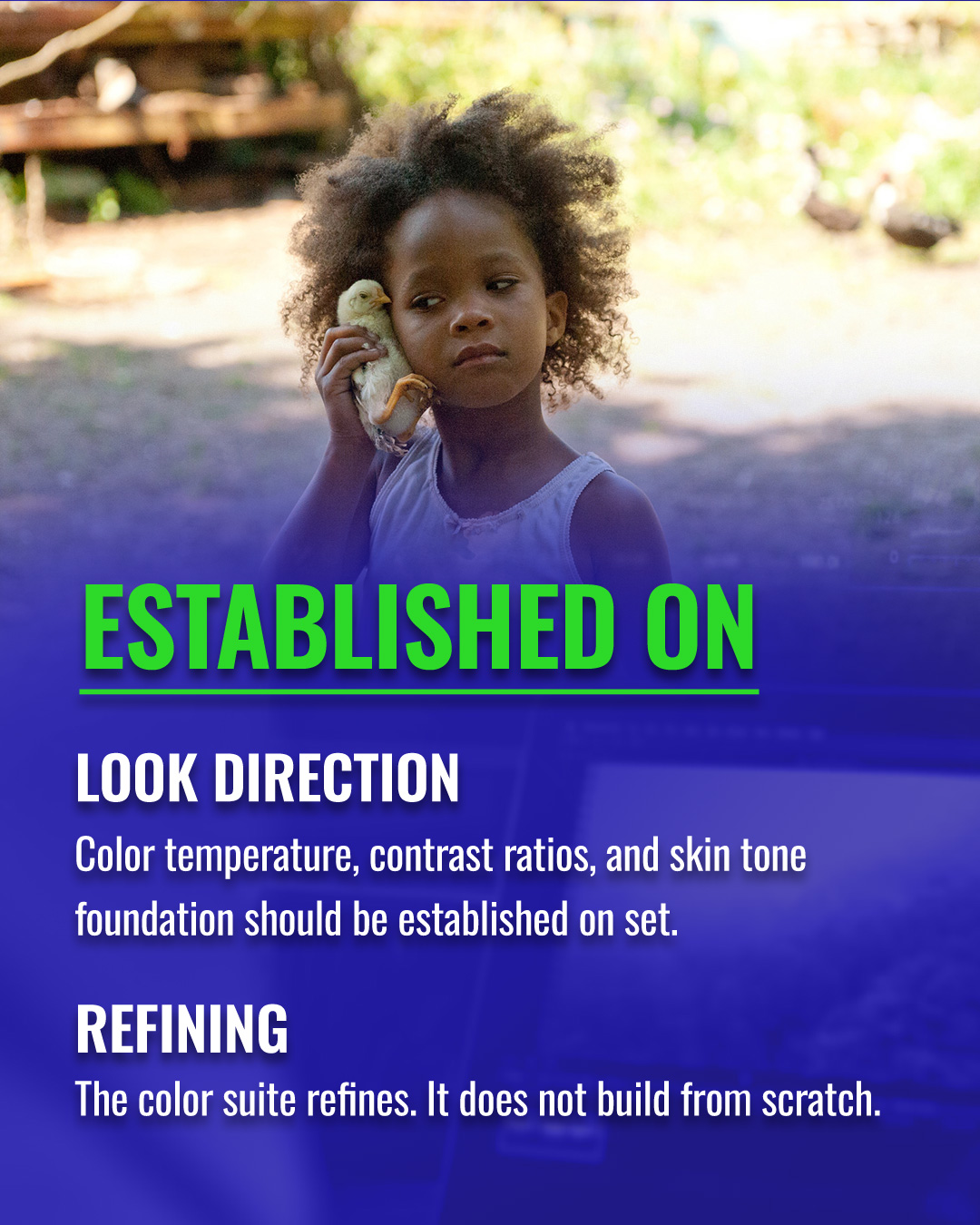
The bedrock of effective color enhancement lies squarely in the hands of the Director of Photography. A DP who approaches a scene with specific color temperature intentions, who meticulously plans contrast ratios, and who understands how light will sculpt and render skin tones, is not just shooting; they are pre-visualizing the final grade. They are making decisive choices with their lighting design – the quality of light, its direction, its intensity, and crucially, its color temperature. Whether it's the tungsten warmth of an ARRI Skypanel, the cool blue cast of moonlight achieved with CTO gels, or the deliberate interplay of practicals, every decision on set is a brushstroke in the larger painting.
"The professional standard is that the color suite functions as a refinery enhancing raw material of established quality, not as a factory manufacturing visual identity from inadequate source material."
Take, for instance, Roger Deakins, ASC, BSC, whose legendary work on films like Blade Runner 2049 and 1917 exemplifies this philosophy. His on-set lighting is so precise, so intentional, that the color grade often feels like an organic extension of his original vision, rather than a corrective measure. He understands the capabilities of his chosen cameras – be it an ARRI Alexa or a Sony Venice – and pairs them with specific lenses, knowing how their inherent character will contribute to the overall texture and color rendition. This mastery allows his colorists to focus on finessing, on bringing out the latent beauty and emotional depth already present in the captured image.
The Perils of 'Fix It In Post'
Conversely, the DP who relies on the grade to fix problems that should have been solved through lighting shifts a significant burden downstream. This 'fix it in post' mentality, while sometimes unavoidable in fast-paced productions, ultimately limits the colorist's options and often results in a less authentic, more manufactured look. When the source material lacks a coherent visual identity, the colorist is forced to build one from scratch, often pushing the limits of the captured exposure and color information. This can lead to artifacts, compromised dynamic range, and a general loss of organic feel.
The camera's sensor choice plays a critical role here. While modern cinema cameras like the ARRI Alexa 35 or RED V-Raptor offer incredible latitude, pushing them too far in the grade to compensate for poor on-set decisions can still yield diminishing returns. The intrinsic color science of these cameras, their ability to render subtle gradations and skin tones, is best preserved when the initial exposure and color balance are close to the desired outcome. Lens character, too, is paramount; the way a vintage Cooke S2 or a modern Zeiss Supreme Prime renders aberrations, fall-off, and micro-contrast contributes significantly to the image's inherent aesthetic, an aesthetic that is difficult, if not impossible, to artificially replicate in the grade.
The Synergy of Craft: DP and Colorist
The ideal scenario is a synergistic relationship between the DP and the colorist, where the DP's on-set decisions provide a robust, high-quality raw material, giving the colorist maximum creative latitude to elevate the image. This is a professional standard, a testament to the respect for each other's craft. The color suite, in this context, functions as a refinery, enhancing raw material of established quality, bringing out its inherent brilliance. It is not a factory manufacturing visual identity from inadequate source material, nor is it a repair shop for on-set oversights.
Ultimately, the distinction between color enhancement and color correction underscores a fundamental truth in cinematography: the most potent visual storytelling begins not in the digital realm, but with the thoughtful, deliberate, and expert manipulation of light and shadow on set. It is a testament to the DP's artistry, technical acumen, and unwavering commitment to crafting images that are not just seen, but felt.
This article contains affiliate links. We may earn a small commission at no extra cost to you. Learn more.