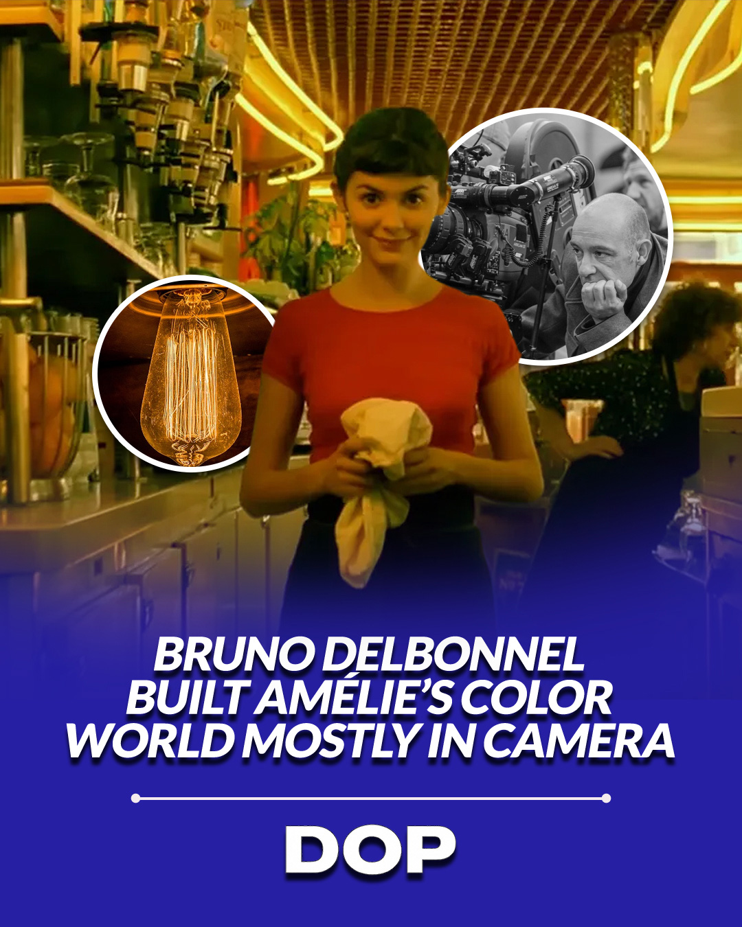
In an era where film stocks are often treated as neutral baselines and digital sensors are approached as blank slates for post-production heavy lifting, Jean-Pierre Jeunet’s Amélie (2001) stands as a monument to intentional visual design. Shot by French cinematographer Bruno Delbonnel, ASC, AFC, the film’s saturated, whimsical portrait of Paris is universally recognized by its rich yellow-green tint and glowing skin tones. Yet modern filmmakers often make the mistake of attributing this signature palette entirely to the color suite. In reality, Delbonnel’s magic was largely baked into the emulsion long before the footage reached a digital intermediate suite.
Building the Palette On Set
Delbonnel’s strategy relied on fundamental color science and optical filtration. By utilizing tungsten-balanced 35mm film stock under tungsten-lit interiors, augmented with warm optical warming filters like Corals and Chocolates, he purposefully pushed skin tones toward an incandescent, honeyed gold. Meanwhile, production designer Aline Bonetto painted sets with deliberate sage greens, olive accents, and deep teals. When lit with slightly cooler ambient sources or allowed to fall into soft shadows, these green surfaces created a vibrant complementary contrast against the warm foreground talent.
By controlling the spectrum of light hitting the negative, Delbonnel ensured that the film stock captured high saturation naturally. Wide-angle focal lengths combined with tight camera placement brought viewers deep into this stylized reality, where every practical lamp and wall texture felt integrated into a singular visual ecosystem.
Contrast Control and the Power of Practical Accents
High color saturation can easily overwhelm a frame, transforming a theatrical feature into something resembling garish video or harsh comic-book HDR. Delbonnel avoided this trap through meticulous contrast management. Rather than hard, punchy key lights, he favored expansive soft sources, large bounce cards, silks, and carefully calibrated book lights, that wrapped around actors’ faces with minimal shadow roll-off.
The simplest path to a distinctive visual identity isn't a complex post-production LUT, it is committing to two or three dominant colors in front of the lens and lighting them with intent.
This low-contrast lighting philosophy kept shadow regions gentle and translucent. Because the shadows weren't crushed, the saturated greens in the background retained structural detail rather than turning into muddy black pools. Crucially, this disciplined yellow-green canvas set up a high-contrast dynamic for rare accent colors. When a pop of bright red appears, whether it is a bowl of ripe raspberries, a character’s trench coat, or a glowing bedside lamp, it leaps off the screen with extraordinary energy precisely because the surrounding palette yields to it.
Why the Digital Intermediate Worked
Amélie was created during the dawn of the digital intermediate (DI) revolution, a period when digital color grading opened unprecedented creative doors. However, Delbonnel did not use the DI to invent a look out of thin air; he used it to fine-tune an image that already possessed a strong organic lean. Because the camera negative already carried warm skin tones and a green ambient bias, the color timing process was subtractive and refining rather than destructive.
For contemporary DPs shooting on clean, hyper-sharp digital cinema camera sensors like the ARRI ALEXA or Sony VENICE, Amélie offers an essential lesson. Digital sensors capture an incredible amount of information, but without in-camera intent, images can quickly feel sterile and unmotivated. Trying to force a neutral digital image into a heavy yellow-green cast in DaVinci Resolve often degrades skin tones and introduces digital artifacts.
By choosing a strong visual theme during pre-production, selecting custom glass or optical filters, and gelling practical fixtures on set, cinematographers give their footage an unmistakable DNA. Bruno Delbonnel demonstrated that true world-building isn't done with a slider, it's built in the craft of lighting, production design, and a deep respect for photographic materials.
This article contains affiliate links. We may earn a small commission at no extra cost to you. Learn more.