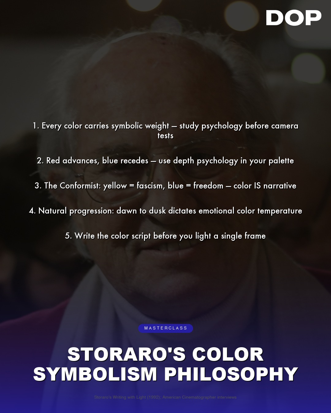
When the name Vittorio Storaro ASC, AIC is mentioned, it’s often accompanied by a hushed reverence within the cinematography community. His filmography reads like a syllabus for visual storytelling: Apocalypse Now, The Last Emperor, Reds, Dick Tracy. Each a masterclass in how light, shadow, and crucially, color, can transcend mere aesthetics to become an intrinsic narrative voice. Storaro isn't just a cinematographer; he's a visual philosopher, an artist whose palette extends far beyond the physical properties of light. The recent sharing of his 'Color Symbolism Philosophy' offers a rare glimpse into the mind of a master, distilling decades of profound visual thought into actionable wisdom for DPs.
Storaro’s first directive, "Every color carries symbolic weight - study psychology before camera tests," immediately elevates the craft beyond technical proficiency. It’s a call to intellectual rigor, urging us to understand the deep-seated cultural and psychological associations of hues before even considering sensor latitude or lens coatings. This isn't about arbitrary choices; it's about informed, intentional decisions that resonate on a subconscious level with the audience. Imagine the stark reds of the brothel in Apocalypse Now – not just a vibrant set piece, but a visceral representation of passion, danger, and primal instinct. Or the ethereal, almost spiritual blues that often accompany journeys of introspection in his work. These aren't accidents; they are the result of a profound understanding of how our minds interpret color.
Depth and Dimension Through Hue
His second tenet, "Red advances, blue recedes - use depth psychology in your palette," is a fundamental principle of visual perception, yet Storaro elevates it to an art form. This isn't merely about creating an illusion of depth on a two-dimensional screen; it's about manipulating emotional and psychological distance. A character bathed in a warm, advancing red feels immediate, confrontational, perhaps even threatening. Conversely, a figure enveloped in cool, receding blues can evoke introspection, isolation, or a sense of peace. Consider the opulent, yet often isolating, interiors of The Last Emperor, where the rich, warm golds and reds of power are frequently juxtaposed with the cool, distant blues of constraint and impending loss. Storaro uses this principle not just for compositional balance, but to comment on character relationships and their internal states.
"Conflict in color = conflict in story - opposing hues create tension." This isn't just about color theory; it's about narrative architecture built with light.
The idea that "Conflict in color = conflict in story - opposing hues create tension" is perhaps the most direct link between Storaro's aesthetic and narrative intent. This isn't just about complementary colors; it's about the emotional friction they generate when placed in opposition. Think of the jarring, almost surreal clash of vibrant, artificial colors in Dick Tracy, reflecting the heightened, almost cartoonish struggle between good and evil. Storaro understands that a visual discord can be as potent as a narrative one, creating an underlying tension that keeps the audience engaged. This requires a meticulous approach to color grading, often pushing the boundaries of what is conventionally considered 'natural' to achieve a heightened emotional reality.
Temperature as Character, Hue as Narrative Arc
Storaro’s insight into light temperature, "Warm light for power, cool light for submission - temperature is character," is a cornerstone of his lighting philosophy. He doesn't just illuminate; he sculpts emotion with Kelvin. A powerful leader might be bathed in a golden, almost divine warmth, signifying authority and dominance. A vulnerable or submissive character, however, might be cast in the cool, almost sterile light of resignation. This is evident in countless scenes across his oeuvre, where the shifting emotional landscape of a character is mirrored directly by the temperature of the light that embraces them. This is not just about setting a mood; it's about providing a non-verbal cue to the audience about the character's internal state and their position within the narrative hierarchy.
Finally, the directive, "One dominant hue per act - let the story breathe through a single key," is a bold, almost symphonic approach to visual storytelling. It suggests a grand, overarching design where color acts as a structural element, guiding the audience through the narrative arc. This requires immense foresight and discipline, ensuring that color themes evolve organically with the story. Imagine a film that begins with the vibrant greens of innocence, transitions to the fiery reds of passion or conflict, and concludes with the somber blues of reflection or resolution. This is a level of pre-visualization and control that few DPs achieve, demanding a deep collaboration with the director and production designer from the earliest stages of pre-production. It's about creating a cohesive, evolving visual language that supports the narrative without ever feeling didactic or heavy-handed.
Storaro’s philosophy is more than a set of rules; it's an invitation to think more deeply about the profound impact of color on human perception and storytelling. For cinematographers working with modern digital sensors, the ability to manipulate color in post-production is greater than ever, but Storaro reminds us that this power comes with a responsibility. It’s not just about what colors look good, but what they mean. His wisdom challenges us to be not just technicians of light, but poets of the spectrum, using every hue to paint emotion, deepen character, and ultimately, tell a more resonant story. His legacy isn't just in the iconic images he created, but in the intellectual framework he has provided for generations of visual storytellers.
This article contains affiliate links. We may earn a small commission at no extra cost to you. Learn more.